
What Is Retro-Futurism in Interior Design? How to Recognize It and Use It at Home
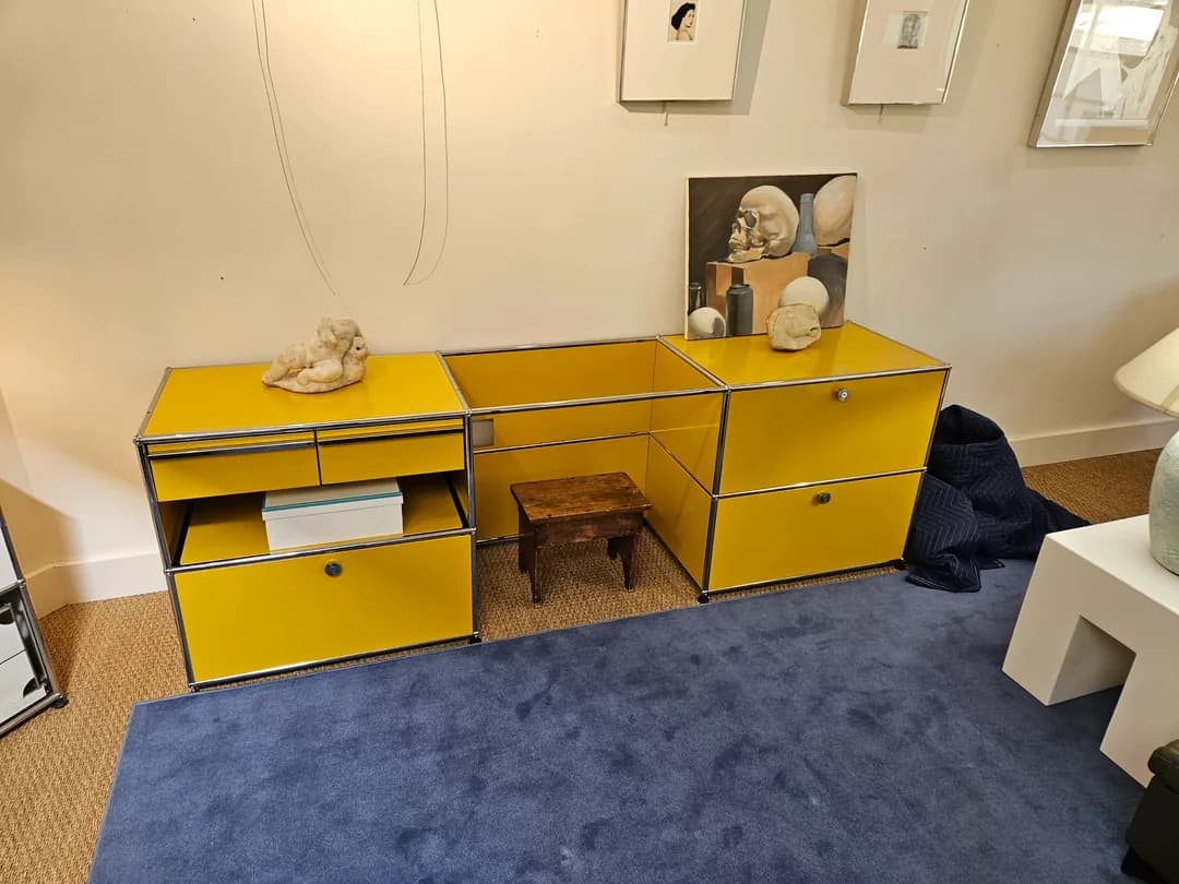
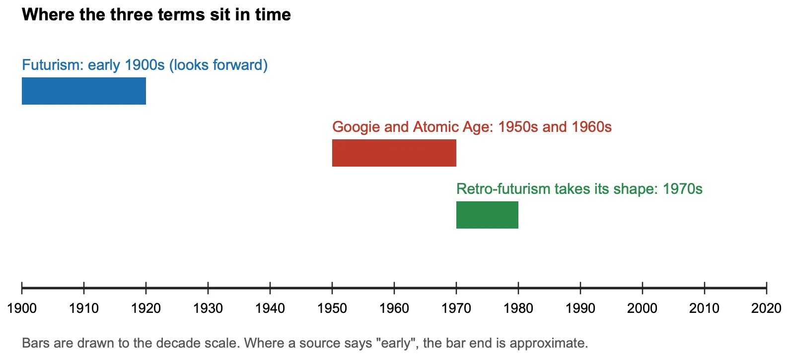
Retro-futurism is the future as earlier decades imagined it: smooth curves, chrome and steel, glossy surfaces and bold blocks of color. Futurism looked ahead from the early 1900s, while retro-futurism looks back at those visions, so the look is a remembered future, not a new one. At home it works best as two or three shiny, rounded pieces against a calm backdrop.
What retro-futurism is
Wikipedia defines retro-futurism as a movement in the creative arts emphasizing depictions of the future as produced in earlier eras. As opposed to futurism, an artistic movement anticipating technological advances, retro-futurism is the remembering of that anticipation. It blends old-fashioned retro styles with futuristic technology, and it took its current shape in the 1970s.
How it differs from futurism
99designs describes futurism as beginning in Italy in the early 1900s, as industrialization and urbanization changed daily life, and fixated on planes, cars, speed and technology. Wikipedia calls retro-futurism a more skeptical reaction to those dreams. SEGD adds that retro-futurism is more a universe of aesthetics than a single style, and lists Googie, Raygun Gothic and Atomic Age among its branches. SEGD places Googie architecture, with its bold geometric shapes and bright colors, in the 1950s and 1960s.
How to recognize it
| Element | What to look for | Source |
|---|---|---|
| Shape | Soft curves and round, flowing forms instead of sharp corners and peaked roofs. | Zillow |
| Material | Chrome, stainless steel, glass and lacquered finishes, set against warm wood or soft fabric. | Zillow, Home Planner |
| Color | Bright, vibrant colors, and metallic finishes such as chrome. SEGD describes Googie and Atomic Age design as bold, bright and vibrant. | SEGD, Zillow |
| Light | Sleek pendant lights, geometric wall sconces and floor lamps with sculptural shapes. | Zillow |
| Pattern | Geometric patterns, kept to one wall, a cushion or a piece of art. | Zillow, Homestyler |
Icons to know
Three pieces come up again and again. Dates are the design year, and sources differ where noted.
| Piece | Designer | Year | Source |
|---|---|---|---|
| Tulip chair | Eero Saarinen | 1956 for the chairs (1957 for the table) | Whoppah, Artsy |
| Ball Chair | Eero Aarnio | 1963 designed, shown in 1966 | V&A, Artsy, Frits Jurgens |
| Djinn chair | Olivier Mourgue | 1963 in the V&A listing, 1965 in other guides | V&A, Homecrux |
The V&A describes Aarnio’s Ball Chair as an icon of pop design, with space-capsule geometry and synthetic materials and colors, and calls the Djinn chair an icon of 1960s futuristic design, in part because of Stanley Kubrick’s 2001: A Space Odyssey. Where sources disagree on a date, as for the Djinn, quote the range.
How to use it at home
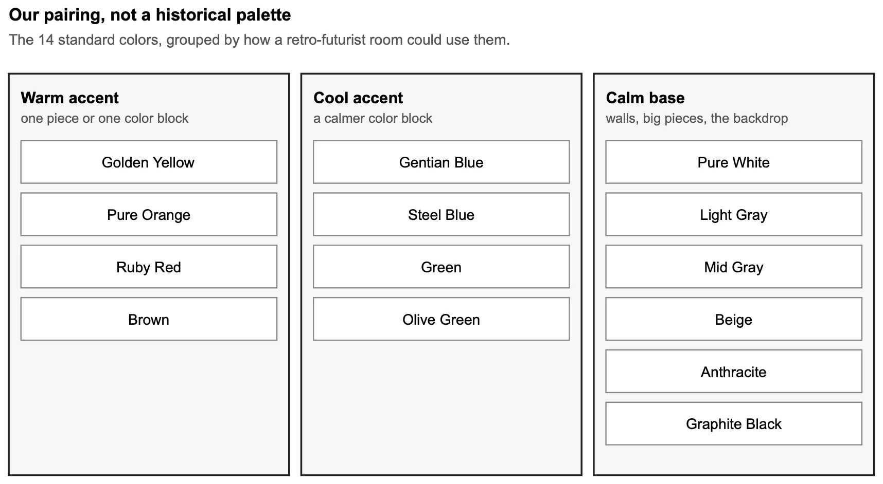
- Start with the backdrop. Homestyler recommends soft beige, white or pale gray walls as a calm base, with color carried by upholstery or art.
- Pick two shiny pieces. A chrome side table, a globe pendant or a curved chair is enough. Homestyler advises fewer statement pieces and wider walkways.
- Add one color block. Home Planner suggests bright color on a black or white base, kept on the rug, the fabrics or the art while walls and floor stay calm.
- Soften it. Zillow suggests pairing chrome with an earth-toned rug and warm neutrals, so the room feels welcoming and not cold.
Where a modular steel unit fits
Arvhi frames are chrome-plated steel with powder-coated metal panels, and the standard palette has 14 colors, including Gentian Blue, Pure Orange, Golden Yellow and Ruby Red. A single modular credenza in one of those colors can serve as the “one shiny piece with a color block” in a room, but it is a modern system, not a vintage piece, and it does not replace the curved seating or lighting this style relies on. None in our range makes pod chairs or pendant lights. See the credenza collection for current pieces.
Fill-in checklist
| Question | Your answer |
|---|---|
| Which wall color is the calm backdrop? | |
| Which two pieces are shiny or rounded? | |
| Where does the one color block go? | |
| What warm or soft material balances the chrome? | |
| Which pattern, if any, and on which surface? |
Frequently asked questions
What is retro-futurism in interior design?
Retro-futurism is a look built from how earlier eras imagined the future: smooth curves, chrome and steel, glossy surfaces and bold color blocks. At home it usually means a few shiny, rounded pieces against a calm backdrop, not a full theme.
What is the difference between retro-futurism and futurism?
Futurism began in Italy in the early 1900s and looked forward, celebrating speed and technology. Retro-futurism looks back at those earlier visions of the future with nostalgia, so the two share imagery but face opposite directions in time.
What colors are retro-futuristic?
Guides describe bright, vibrant accent colors together with metallic finishes such as chrome. Several suggest keeping walls calm in white, beige or pale gray and letting the color sit on upholstery, rugs or art.
How do I keep a retro-futuristic room from feeling cold?
Zillow suggests balancing sharp, shiny elements with soft, organic materials and warm neutral colors, for example chrome bar stools with an earth-toned rug. Homestyler adds fewer statement pieces and wider walkways, rather than crowding the room.
Sources
- Wikipedia, Retrofuturism.
- 99designs, Back to the future: why retrofuturism is the look of our times.
- SEGD, Retrofuturism: a new SEGD series by Eli Kuslansky.
- Zillow, How to buy a retro-futuristic home.
- Homestyler, Retro-futuristic furniture: how to master its spatial and aesthetic dynamics.
- Home Planner, Retro interior design: 1960s and 70s style at home.
- Victoria and Albert Museum (V&A), Space-Age chairs.
- Whoppah, 10 design icons and their incredible story.
- Artsy, 11 iconic design works that art collectors love.
- Frits Jurgens, An inspiring work environment.
- Homecrux, 10 famous chairs in movies and pop culture.
These are descriptions of a design style, not rules. Your room, light and taste decide how much of it to use.